About the company
Bellissima Fashions was a women’s fashion retailer with 11 physical locations across Western Canada.
This project represents work completed while the company was still operating.
This project represents work completed while the company was still operating.
My role
Take a look at my design showcase, where my primary focus at Bellissima Fashions was revolutionizing email marketing through captivating eblasts. As the lead designer for this crucial communication channel, I was entrusted with shaping the brand's digital narrative and enhancing user engagement. During my stay, I managed a steady increase in email subscribers and kept the unique open rate between 25-27%, slightly above the industry standard.
About the process
Email template analysis
Email templates
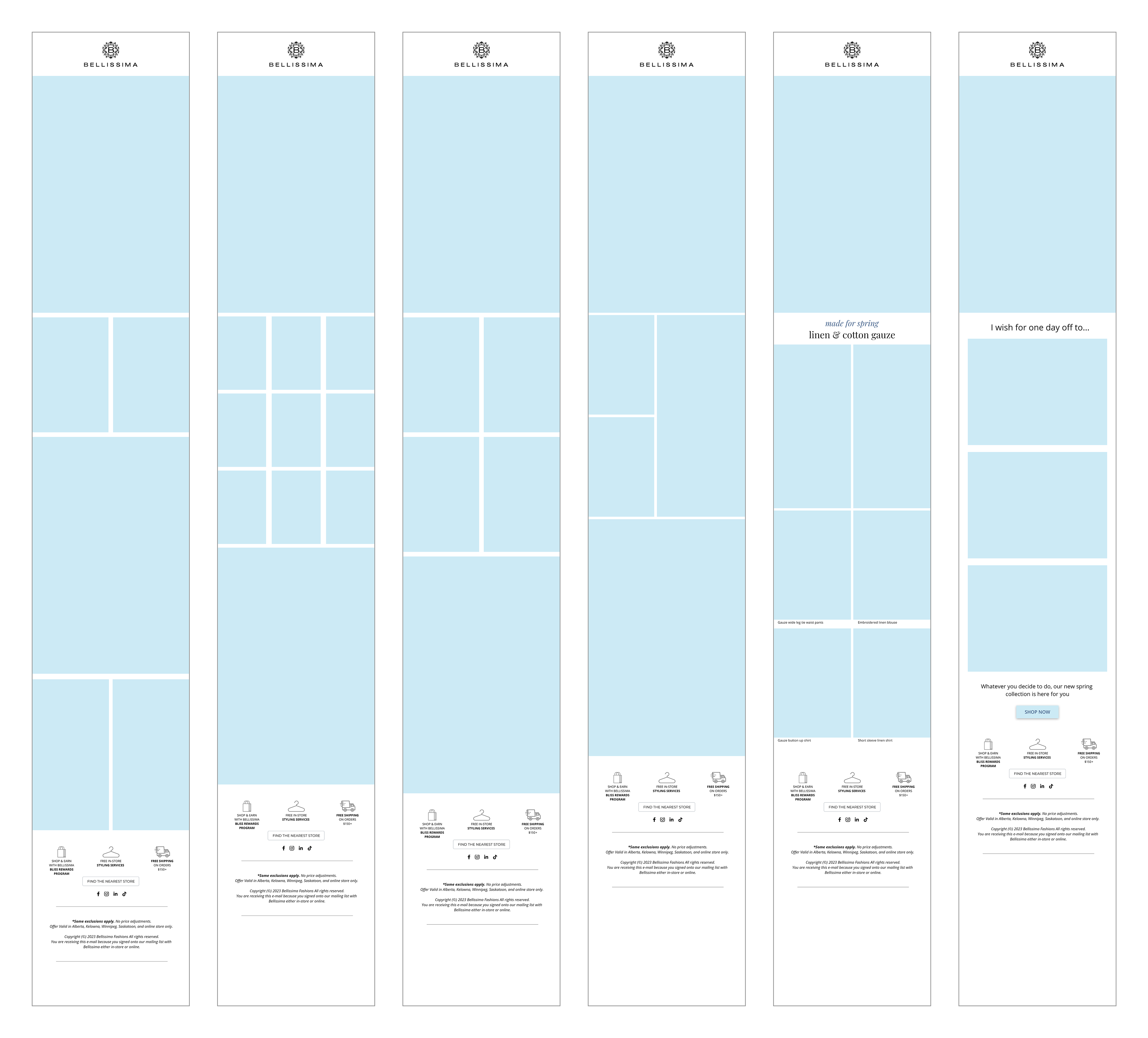
I developed and implemented a responsive template system over time, streamlining the design process and ensuring consistency across email campaigns. These templates became valuable assets for future projects, saving time and maintaining brand coherence.

Email structure

Email template - content layout examples
Copywriting rules
Expanding on our progress, we formulated copywriting guidelines to fortify consistency throughout our email campaigns. By exploring varied text styles, placement options, and display approaches for sale banners and action buttons, we refined our templates for amplified impact. These initiatives further solidified our template framework, enriching future projects and preserving brand coherence.
Photo retouching
Moreover, I paid meticulous attention to detail by optimizing the size of images used in eblasts, ensuring fast load times and optimal viewing experiences for recipients. When necessary, I also performed retouching and light adjustments to enhance the visual appeal of the content, ensuring that every aspect of the eblast was polished to its perfection.
Email automatizations
Welcome email
One of our first implemented email automations was a Welcome email, linked to a pop-up banner on our website. We're hooking first-time website visitors with a tempting incentive to join our mailing list.
We went for a clean, simple design to ensure the message remained crystal clear. We had a fun debate over two versions — one featuring just text and the other boasting a captivating photo. The photo version won because it vibes perfectly with our brand and facilitated a seamless connection between the pop-up banner and the welcome email, enhancing the user experience. To maintain dynamism, we rotate the main photo monthly, keeping our users engaged and ensuring a contemporary vibe.
Abandoned cart
The second email automation comprises three carefully crafted messages strategically timed to re-engage customers who have left items in their shopping cart. We aim to effectively reconnect with customers and encourage them to complete their purchase journey.
The first email, titled 'Hello, Did you forget about me?' is sent shortly after the customer's visit, delivering a concise yet compelling message to prompt immediate action. Featuring a personalized graphic of a shopping bag and a prominent 'Checkout' button, it cuts straight to the chase.
The second email goes a step further by including photos of the products the customer added to their cart, serving as a gentle reminder of their selections.
Finally, the last email employs a heartfelt approach, featuring a handmade graphic of a sad shopping cart alongside product images and a link to our lookbook for added inspiration.
Regular eblasts
Every week we send out a few eblasts to keep subscribers in the loop about the latest news, promotions, and product offerings. Each eblast project was meticulously crafted to deliver an immersive and seamless experience for our audience. From conceptualizing intuitive layouts to optimizing visual elements, my goal was to captivate subscribers and drive conversion. We focused on elevating each promoted style and creating an easy user journey to improve the overall user experience.
Campaigns
summer sale
During the year, we were promoting seasonal campaigns such as 'Summer Sale'. These campaigns were usually promoted both online and in-store for the whole season. For this one, I crafted an email campaign, designed a website sale banner, and created eye-catching signages for physical stores. This cohesive approach ensured brand consistency across digital and physical platforms, maximizing impact and customer engagement.
Denim for a cause
Based on a company photoshoot done by my colleagues, I designed a heartfelt email campaign to spotlight Bellissima's charitable initiatives, effectively communicating the brand's commitment to social responsibility while engaging customers in meaningful action.
JR Trunk show
I orchestrated email notifications for a multi-city event, ensuring subscribers were informed and excited. With a series of countdown emails, I kept anticipation high and streamlined RSVP management with an automated questionnaire system. By implementing Excel functions, I tracked RSVPs and attendance, ensuring a seamless event experience. The RSVP option was also available on our website and over the phone, which resulted in more event attendees.
Curious to see more projects?