UX/UI concept exploration
Landing page redesign exploring a more modern, data-driven experience for an AI-powered energy management platform.
PROJECT OVERVIEW
Enerlytiq is an energy analytics platform helping organizations reduce energy waste through data-driven insights.
As part of a design exercise, I explored how the landing page could better communicate product value and support conversion aligned with current UX/UI trends.
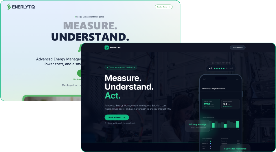
Original website
Project type
UX/UI redesign concept
UX/UI redesign concept
Role
UX research · UX design · UI design
UX research · UX design · UI design
Scope
Landing page redesign
Landing page redesign
Tools
Figma · Adobe XD · AI tools · rapid prototyping
Figma · Adobe XD · AI tools · rapid prototyping
Timeline
~1–2 days design exercise
~1–2 days design exercise
Objective
The goal of the exercise was to explore how the landing page could:
Improve clarity of the product value proposition
Better showcase analytics capabilities
Create a more modern SaaS visual language
Support stronger conversion paths
Better showcase analytics capabilities
Create a more modern SaaS visual language
Support stronger conversion paths
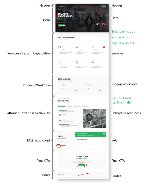
Key improvement opportunities
- Stronger product storytelling
- Clear value proposition in the hero section
- Better visualization of data and analytics
- Clearer information hierarchy
- More modern UI language aligned with AI / SaaS products
- Clear value proposition in the hero section
- Better visualization of data and analytics
- Clearer information hierarchy
- More modern UI language aligned with AI / SaaS products
Design approach
The redesign focused on improving clarity, structure, and perceived product value rather than only refreshing the visual style.
The design exploration focused on:
- clearer messaging hierarchy
- stronger product-centric visuals
- highlighting measurable outcomes (e.g., energy savings)
- modern SaaS-style UI patterns
- clearer messaging hierarchy
- stronger product-centric visuals
- highlighting measurable outcomes (e.g., energy savings)
- modern SaaS-style UI patterns
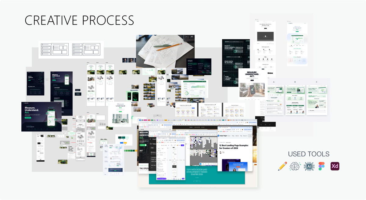
The exploration included quick research, structure redesign, and rapid visual concept development.
Design exploration
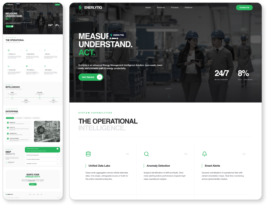
Two visual directions were explored to test different approaches to tone, hierarchy, and visual emphasis.
Focus on improving clarity of product value within the first screen.
Focus on improving clarity of product value within the first screen.
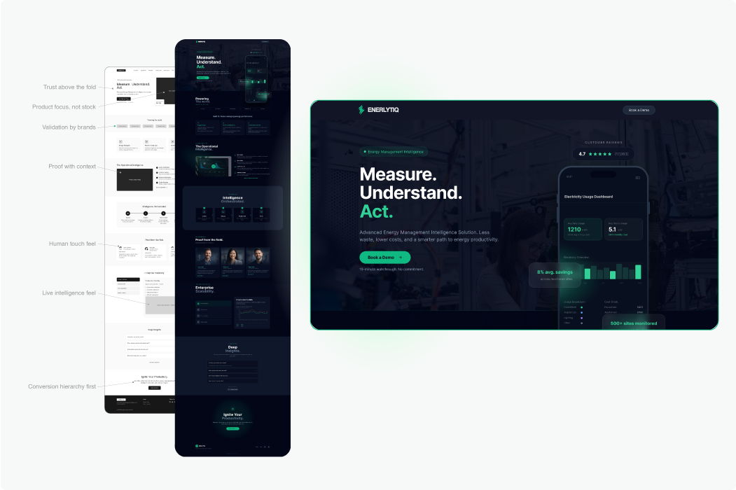
A darker interface exploring a more technical and data-driven visual style, emphasizing the analytical and AI-powered nature of the platform.
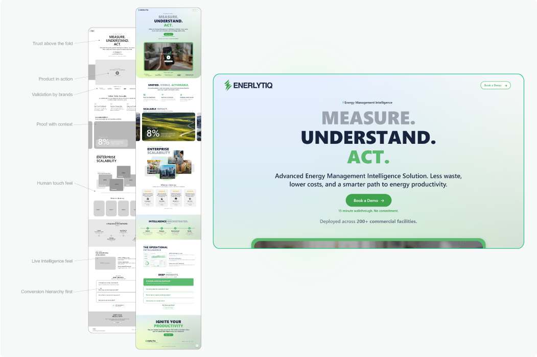
A lighter interface focused on clarity, simplicity, and accessibility, using soft backgrounds and clean typography to communicate trust and transparency.
Reflection
This project was a rapid design exploration created as part of a hiring exercise. Despite the limited timeframe, it provided an opportunity to explore how clearer messaging, modern UI patterns, and stronger product storytelling could improve the perceived value of the platform.
Even small improvements in messaging hierarchy can significantly impact how quickly users understand the product value.